Overview
The Challenge
Research
Good Spoon is a non-profit organization that supports homeless and low income Latino families in the DMV area (D.C., Maryland, and Virginia). I was brought in to redesign their outdated website to make it more user-friendly, accessible, and visually aligned with the organization’s mission.
Role
UX Research
UX/UI Design
Tools
Figma
Illustrator
Photoshop
Timeline
5 Days (March 2025)
The original Good Spoon website lacked clear navigation, visual hierarchy, and support for donations and volunteer sign-ups. Key information was hard to access, making it difficult for the community to use effectively.
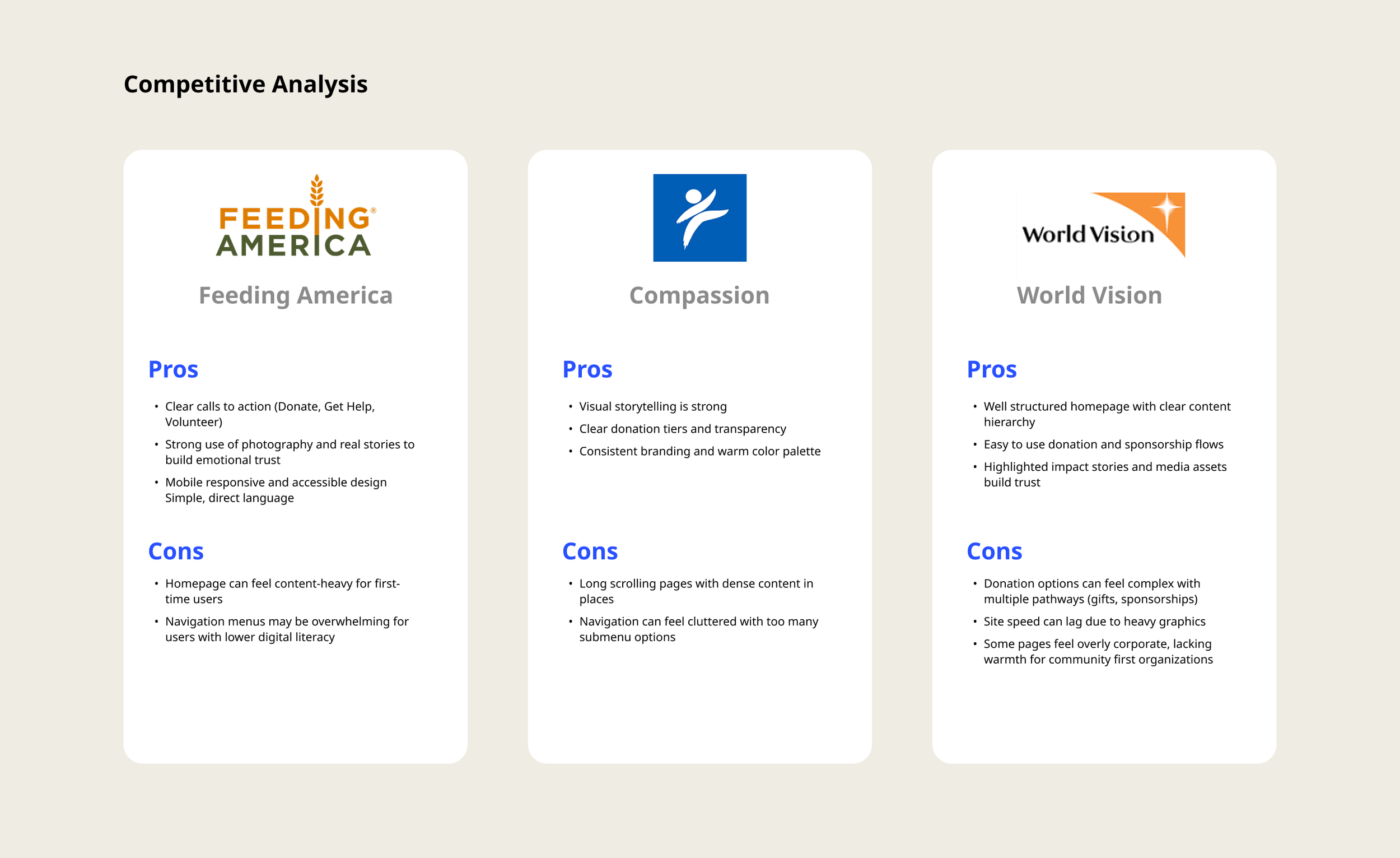
With only 5 days to complete the redesign, research focused on quickly gathering insights to inform a clear, accessible user experience.
UI Design
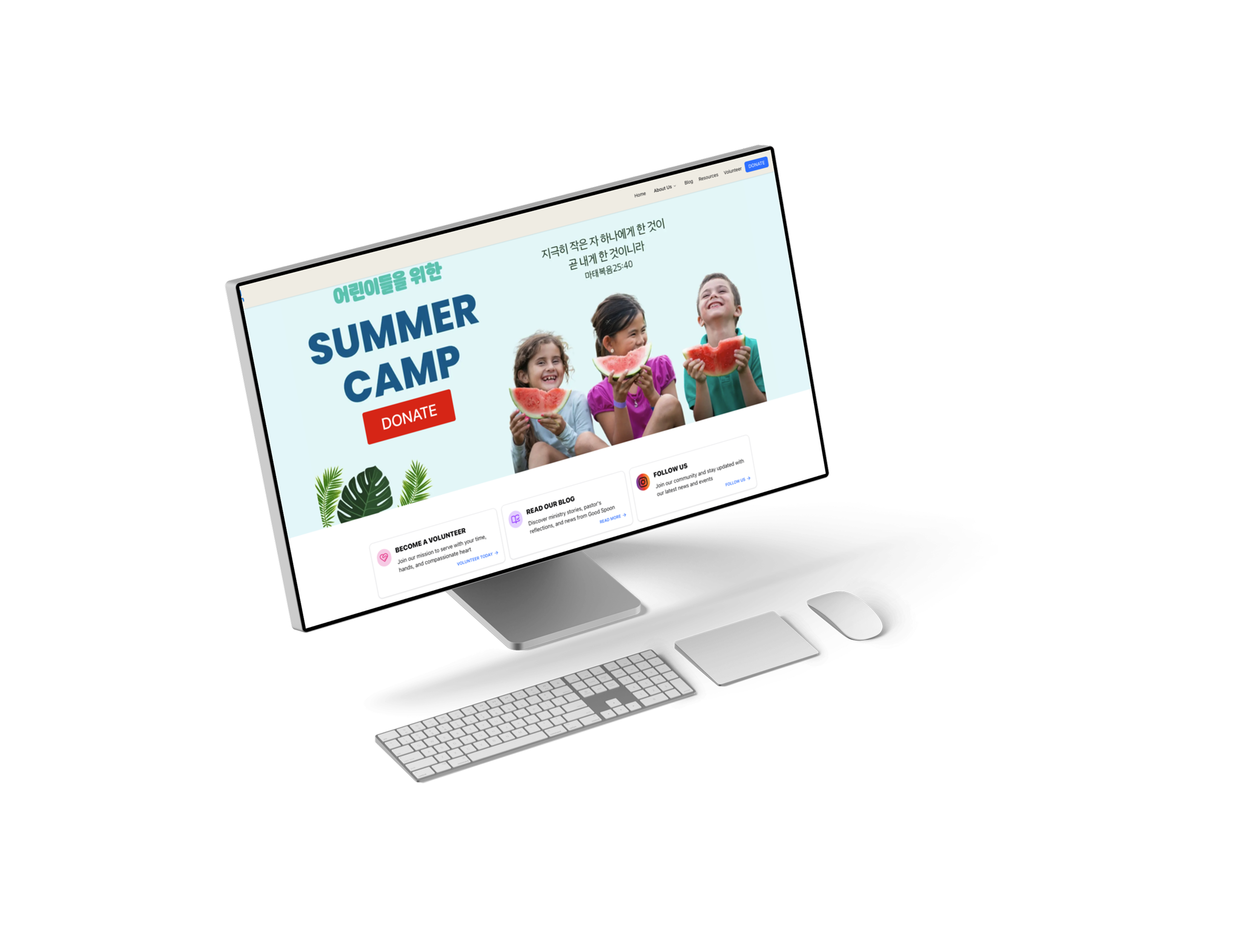
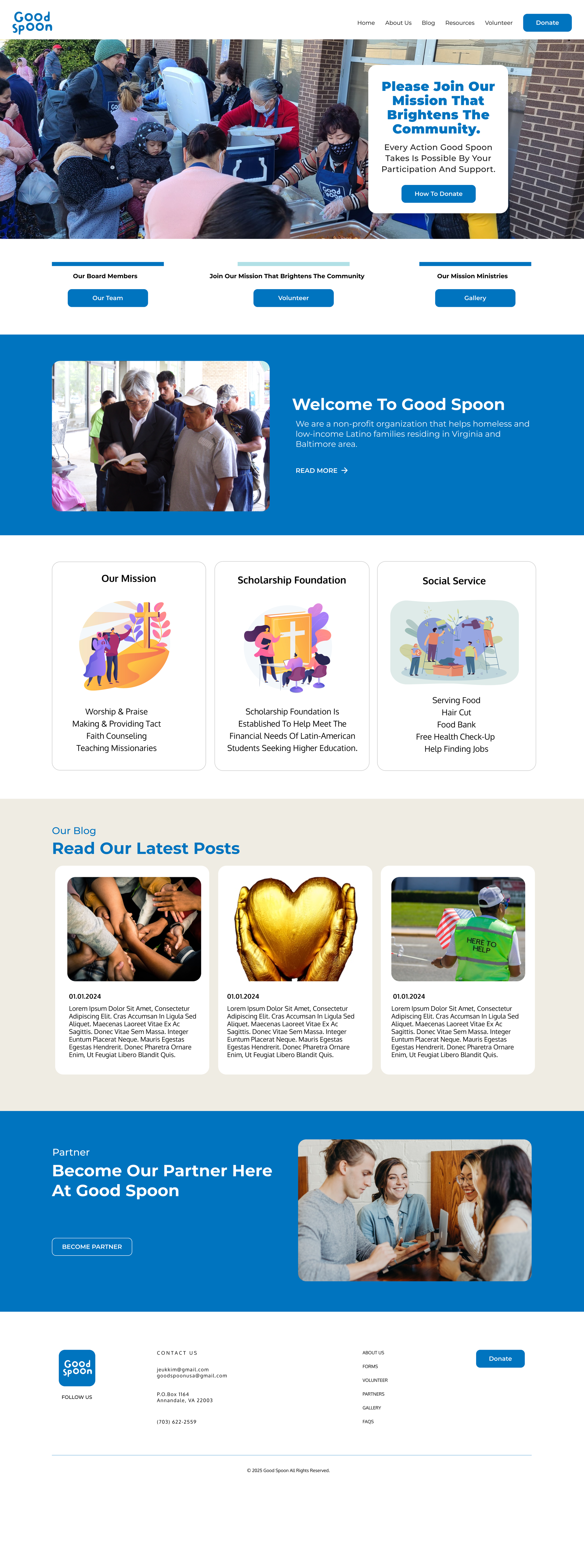
The final design is clean, clear, and welcoming, making it easy for users to understand Good Spoon’s mission and take action through simple navigation and strong visual hierarchy.
Home Page | About Us Page
Goal
Persona
The goal of this project was to redesign the Good Spoon website so it would be easier to use. The new site design needs to help families find support quickly and make it simple for people to donate or volunteer. It also had to feel clear, trustworthy, and work well on mobile devices.
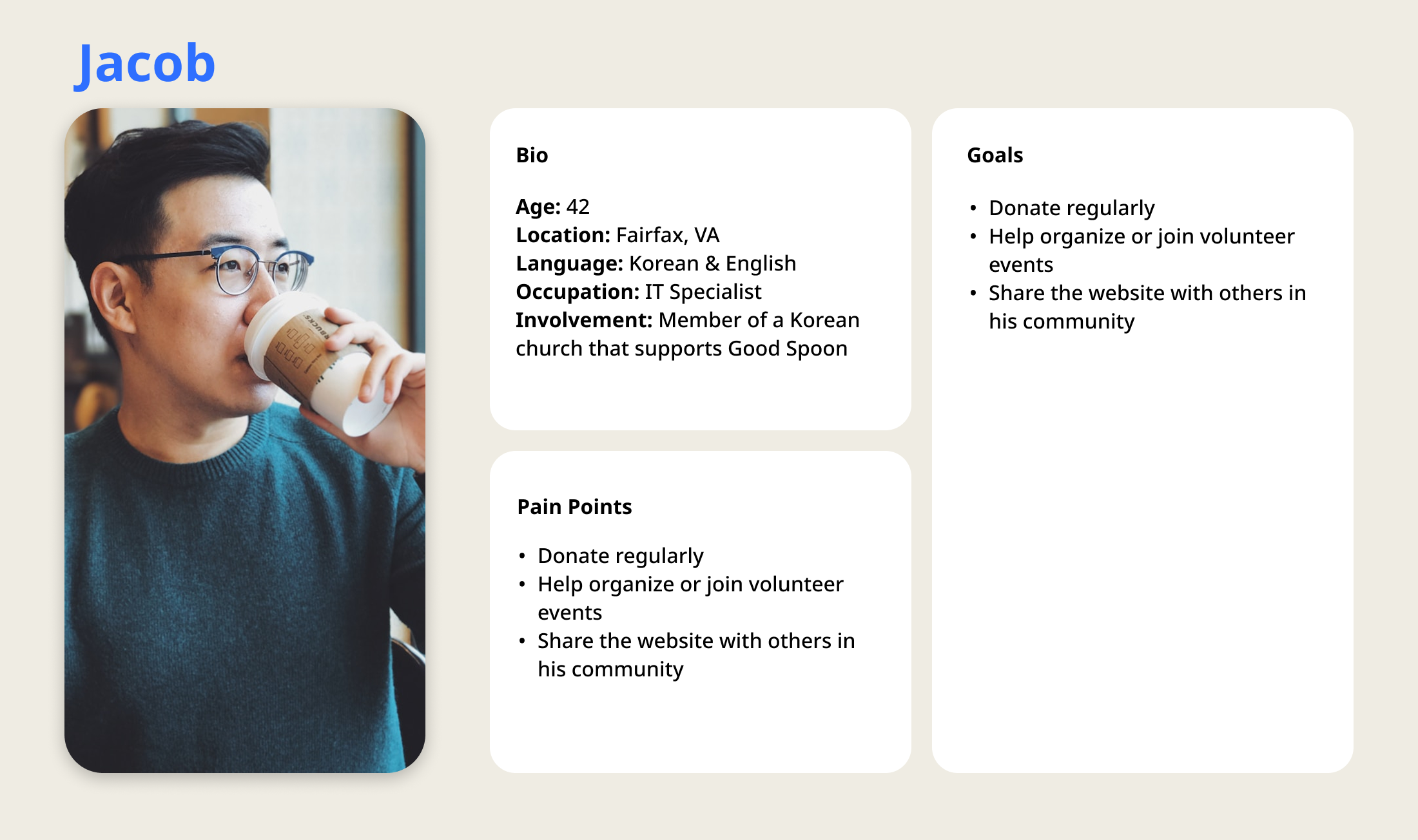
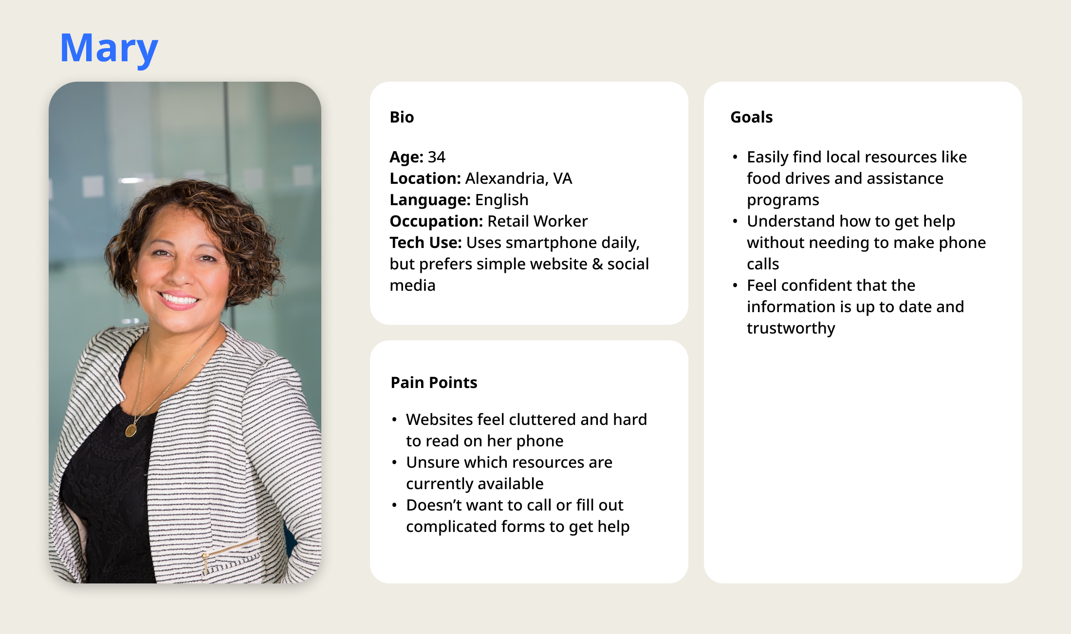
To better understand the needs of Good Spoon’s users, two key personas were created. One representing a community member seeking support, and another representing a Korean community member looking to help. These personas helped guide design decisions by focusing on real user goals, and pain points.
Design Process
With only one week to complete the redesign, the process was fast and focused. The software engineer I partnered with asked me to create just two essential pages to start: a new Homepage and an About Us page. These would serve as the foundation for future development.
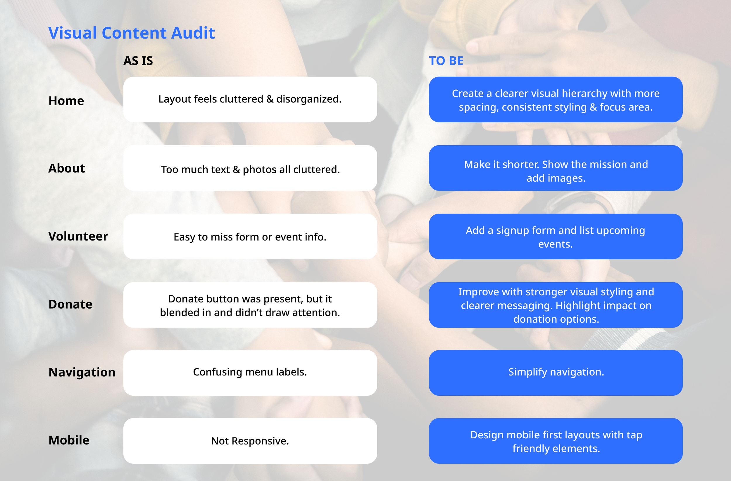
KEY INSIGHT 2
Donation and Volunteer Options Weren’t Clear
Although a donate button existed, it was easy to overlook. Volunteer information was also hard to find.

Wireframe
Visual Improvements
KEY INSIGHT 1
Cluttered Layout Makes Navigation Difficult
Users had trouble finding important information due to a lack of visual hierarchy and clear structure on the homepage.


KEY INSIGHT 3
Too Much Unnecessary Text, Not Enough Useful Information
The site included long paragraphs with little relevant content. Key details like services, how to get involved, or contact info were missing or hard to find.
To organize the content more effectively, I created a low-fidelity wireframe for the homepage. It focused on simplifying navigation, highlighting key actions like “Donate,” and introducing Good Spoon’s mission with clear visual hierarchy. The layout was designed to be clean and easy to scan, helping users quickly understand what the organization offers.

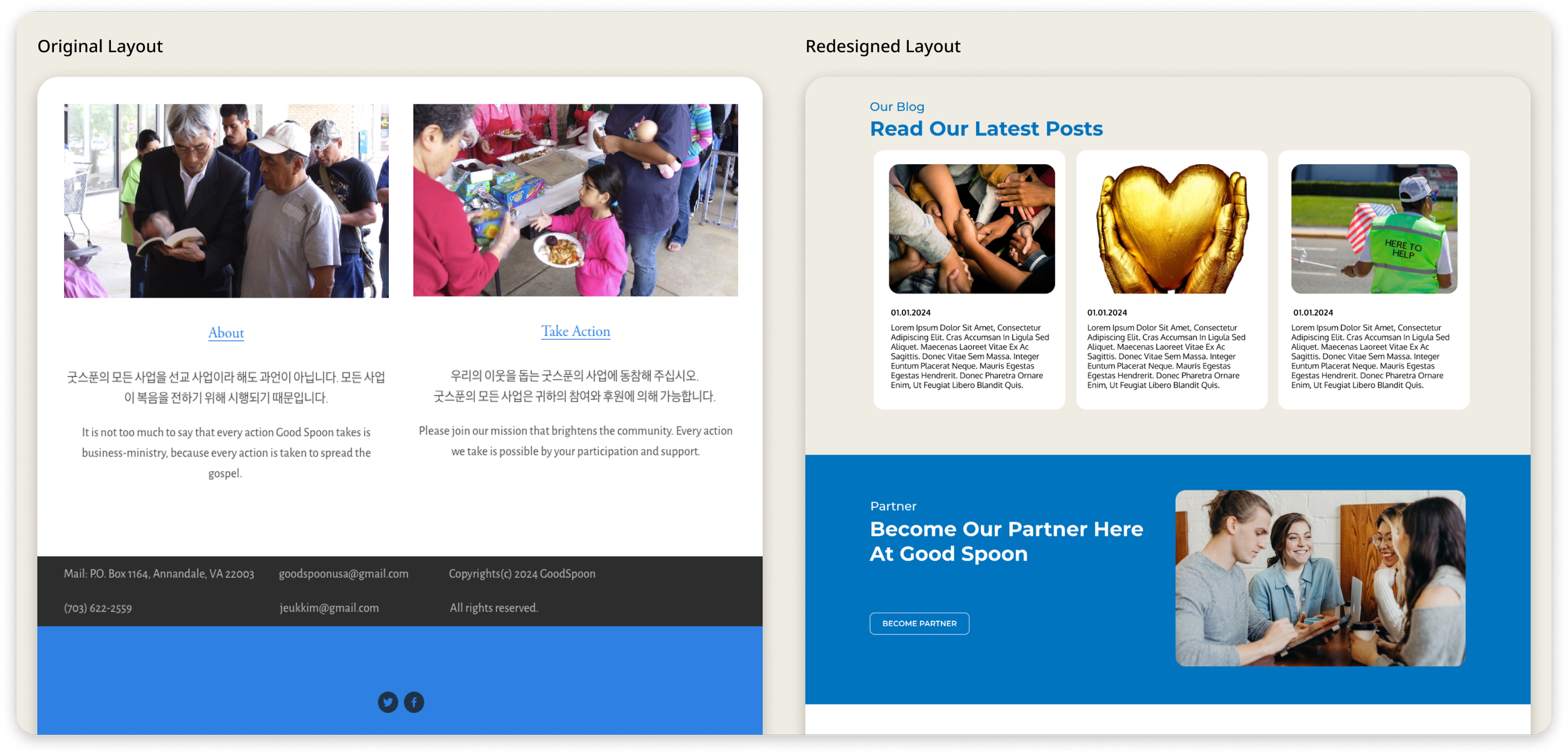
I redesigned key pages to be more focused, clean, and action-driven. Below is a comparison of the original and updated designs.


Style Guide
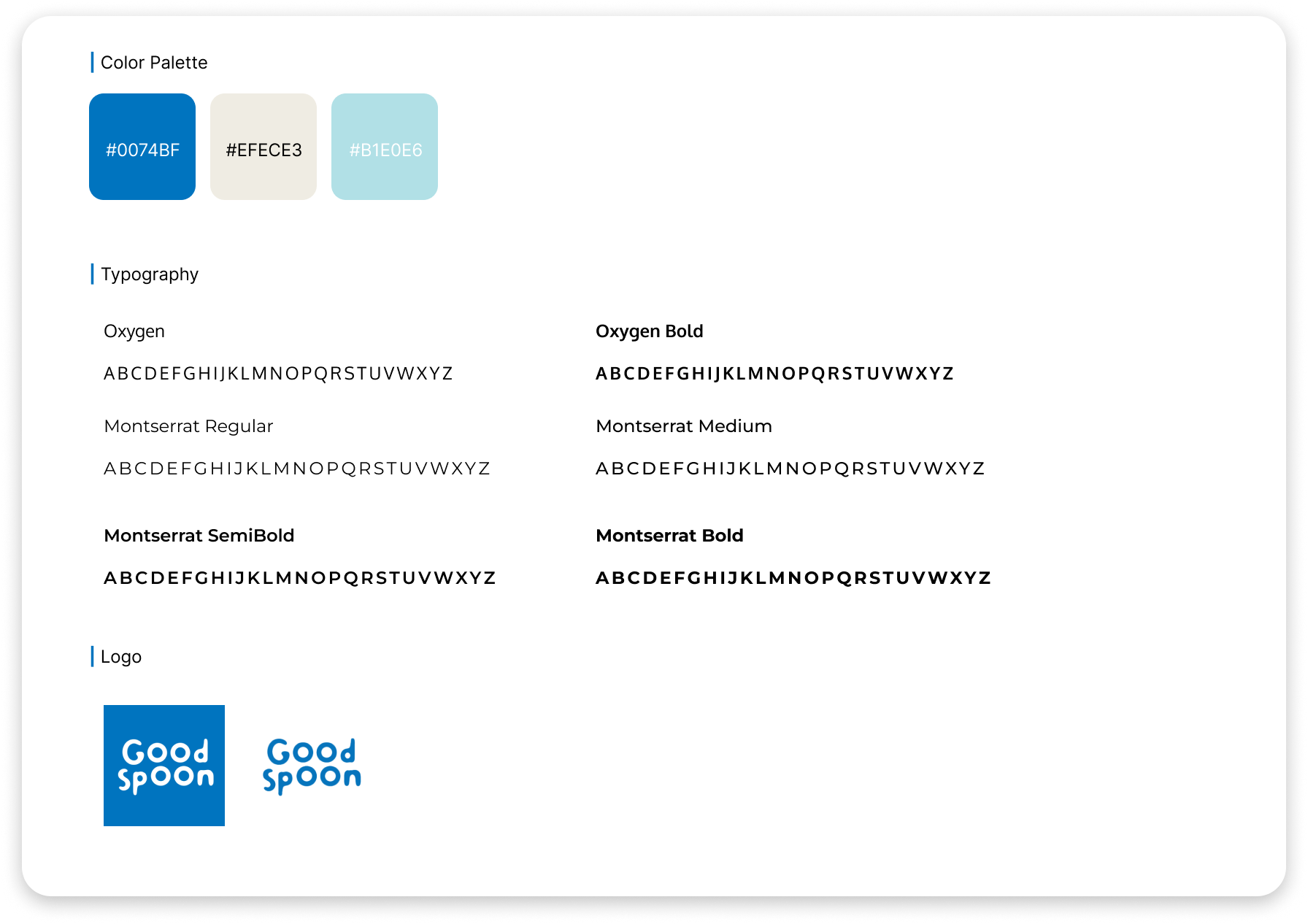
A calm, friendly visual style was developed to make the experience feel approachable and aligned with Good Spoon’s mission.
Outcome
Reflection
The developer was happy with the final design and said it was easy to build. The new pages are now live and make it easier for people to understand what Good Spoon does and how to get involved. You can view the live site here.
This project taught me how to work quickly and stay focused on what matters most to users. Designing in just one week pushed me to make clear decisions and prioritize simplicity. If I had more time, I would continue working on all the remaining pages to create a fuller, more complete experience for both the community and potential supporters.
NEXT STEPS
Design and build remaining pages (Contact, Volunteer Form, etc.)
Conduct user testing with both community members and donors
Optimize design further for mobile use
Explore adding features like an event calendar or donation progress tracker
